


No matter where you are in the world, if you haven’t heard, it’s brat summer.

Charli XCX's album Brat is making waves, not only in the music industry but also in broader cultural and political arenas. The album’s distinct minimalist visual identity—a purposefully pixelated black text on a vivid green background—has propelled the striking use of the colour chartreuse to the forefront of contemporary aesthetics.

This bold green has become synonymous not just with the album but with a ‘Brat’ lifestyle. This way of life radiates wild party girl energy, mixed with a subtle undercurrent of millennial anxiety and sentiment. At the same time, it embodies the essence of a fun-time, carefree, cool girl. Someone unapologetically themselves. Someone you want to be friends with.
This characterisation has resonated deeply with youth culture, transforming the bold green from mere music marketing, into a hue that collectively represents the ‘online’ generation as a whole, impacting everything from fashion trends to political strategies.
Key political figures have capitalised on this to connect with younger audiences. London's mayor Sadiq Khan recently adopted the iconic green backdrop for an Instagram post about the Ultra Low Emission Zone, and in the United States, Kamala Harris's campaign team incorporated chartreuse into her Twitter banner graphics. Charli XCX even endorsed the presidential candidate, tweeting the ultimate praise: ‘kamala IS brat.’

When it came to selecting the album cover colour, Charli told Billboard that she was inspired by “a 1990s neon rave flyer and the title credits to Gregg Araki’s 2007 comedy, Smiley Face.” Working with designer Brent David Freane, the pair considered around 500 different shades of green before landing on this one. Charli described the colour as “actually quite disgusting,” specifically chosen to “spark a really interesting conversation about [desirability]. It had to be really unfriendly and uncool.” Yet, this neon hue has become the coolest colour of the summer.
This 'ugly' colour has rebranded so dramatically that it has become desirable and aspirational almost overnight. It makes us wonder if we've ever really seen it before. Has brat green always been there, waiting for us to notice it?
This question prompted us to delve into the art history books, searching for this vibrant hue in prominent works of art.
Let’s start at the very beginning.
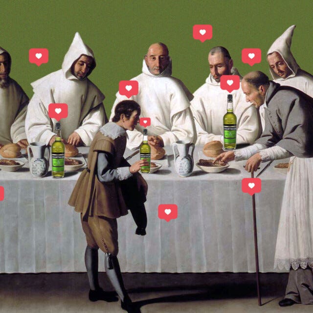
Brat green, more specifically known as Chartreuse, derives its name from a liqueur produced by Carthusian monks in the French Alps, c. 1737. The beverage, known for its distinct greenish-yellow colour, was made using a secret blend of herbs and plants. The colour chartreuse first entered the lexicon in 1884, directly inspired by this vibrant drink.
The early twentieth century saw chartreuse gain prominence in the burgeoning modernist art movement. Artists were breaking away from traditional forms and palettes, seeking new ways to express the rapidly changing world around them.


Henri Matisse, one of the leading figures of Fauvism, frequently employed chartreuse in his works. The Fauves, known for their bold use of colour, found chartreuse perfect for conveying energy and dynamism. In 1905, Matisse painted one of his most famous works, Portrait of Madame Matisse. The Green Line, a portrait of his wife, Amélie. Her oval face is bisected with a slash of neon green which acts as an artificial shadow line, dividing the face chromatically, depicting both a cool and warm side. Here, Matisse experiments with chartreuse, using the unorthodox colour to release ‘green’ from its descriptive, naturalistic functions and allowing it to act as a force in its own right.
Similarly, Georgia O’Keefe’s Calla Lillie on Red (1928) uses chartreuse as an accent. She emphasises green as the dominant colour in nature, but by employing it vividly in details, she elevates the calla lily to become more impactful on the canvas. O’Keeffe’s intent to consider the natural world in a new way was explored even more deeply throughout the twentieth century when artists such as Helen Frankenthaler produced their own distilled and powerful reactions to their environment.


Over time, we can observe chartreuse transitioning from being used as a radiant highlight, to becoming more dominant in compositions. In Lee Krasner’s Seated Figure (1938-39), her earliest known collage work, chartreuse is the striking standout element. Made in the years the artist studied with Hans Hofmann, who had recently emigrated from Europe, the painting reflects the influence of European modernists, namely Picasso-inspired Cubism and a Matissean use of colour. This early work preceded Krasner’s impact on the Abstract Expressionist movement in the US.
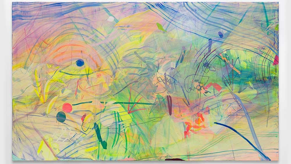
Helen Frankenthaler’s Nature Abhors a Vacuum (1973) exemplifies the use of chartreuse within the Ab-Ex movement. Titled after a phrase coined by Aristotle, Frankenthaler abstracts nature, filling the canvas with vivid hues, including a bright brat green.


The vivacity of chartreuse makes it a perfect colour for artists experimenting with bold and unconventional ideas, imbuing their works with a sense of freedom. In Andy Warhol’s Ladies and Gentlemen (Wilhelmina Ross) (1975), a sharp triangle of chartreuse adorns the shoulder of Wilhelmina Ross. Born in the body of a man, Ross lived as a woman and delighted her audience as a drag queen on stage. Radiating self-confidence, Warhol’s portraits celebrate her essence in a positive array of bright colours during a time when gay and civil rights were at the forefront of politics.
Feminist artists have also utilised chartreuse for its vibrant, eye-catching hue, which is capable of drawing attention and conveying important messages. Lisa Yuskavage’s Big Blonde with Hairdo (1994) floods the canvas with green, grounding the central figure on a hazy patch of chartreuse. Commanding and provocative, Yuskavage’s work presents female figures free from shame, belonging to no one but themselves.
In contemporary art, chartreuse continues to symbolise innovation and boldness. Jadé Fadojutimi’s How to Protect a Smile (2022) includes large swathes of chartreuse and light-sensitive paints that change colour over time, rendering the artwork eternally in progress. This piece was first presented at her solo exhibition at Hepworth Wakefield, aptly titled Can We See the Colour Green Because We Have a Name for It?. Green is a healing colour for Fadojutimi, and in How to Protect a Smile, she explores its meaning in the context of global warming and the ever-changing natural world.
From its monastic origins to its current viral pop-culture rebrand, chartreuse remains a vibrant testament to the power of colour in shaping our visual culture. The Brat movement has demonstrated the formidable intersection of music, fashion, art, and politics, highlighting how colour can create impactful visuals that unite and define a community or even an entire generation.
What artworks do you think are brat?